
Why Mobile-First Matters More Than Ever
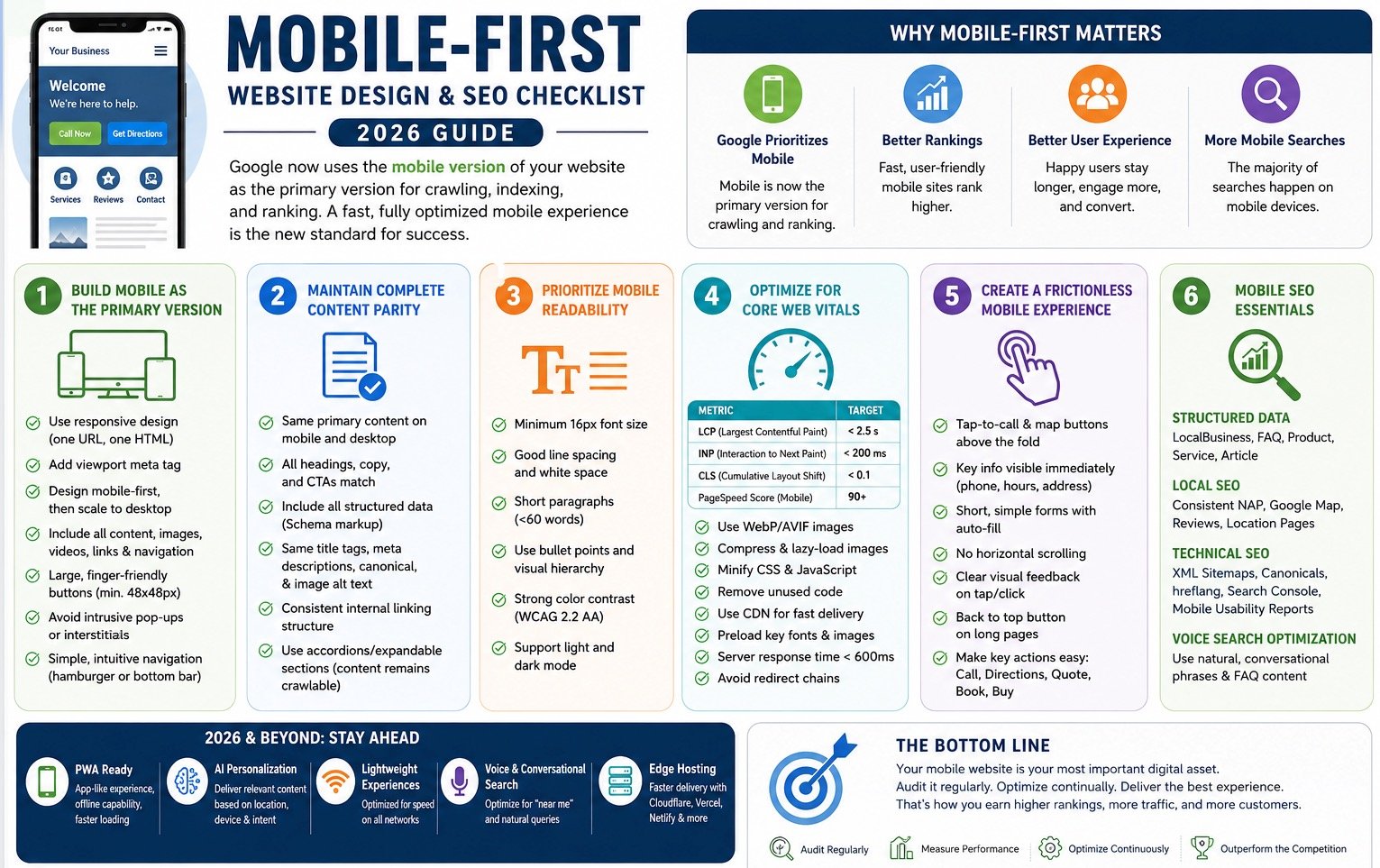
Google now uses the mobile version of a website as the primary version for crawling, indexing, and ranking. In practical terms, your mobile website is no longer a secondary version of your business online—it is the version Google evaluates first.
If your mobile website contains less content, fewer links, missing structured data, or provides a poor user experience compared to desktop, your search visibility can suffer.
As mobile searches continue to dominate across nearly every industry, a fast, fully optimized mobile experience has become the baseline for SEO success.
2026 Mobile-First Website Design & SEO Checklist
1. Build Mobile as the Primary Version
Goal:
Ensure your mobile website serves as the foundation for both search engines and users.
Best Practices:
- Use responsive design with a single URL structure.
- Implement the viewport meta tag:
<meta name="viewport" content="width=device-width, initial-scale=1">- Design for mobile screens first, then expand to desktop.
- Ensure all content, images, videos, links, and navigation elements appear on both desktop and mobile versions.
- Create large, finger-friendly buttons and navigation elements.
- Avoid intrusive popups that block content.
- Maintain simple, intuitive mobile navigation.
2. Maintain Complete Content Parity
Goal:
Ensure Google sees the same valuable content on mobile as it does on desktop.
Best Practices:
- Display the same primary content on all devices.
- Maintain consistent headings, service descriptions, and supporting content.
- Include all structured data (Schema markup).
- Preserve title tags, meta descriptions, canonical tags, and image alt text.
- Keep internal linking structures consistent.
- Use accordions and expandable sections when necessary, while ensuring content remains crawlable.
3. Prioritize Mobile Readability
Goal:
Make content easy to consume on smaller screens.
Best Practices:
- Use a minimum 16px font size.
- Maintain generous line spacing and white space.
- Break long content into shorter paragraphs.
- Use bullet points and visual hierarchy.
- Ensure strong color contrast for accessibility.
- Support both light and dark viewing modes.
4. Optimize for Core Web Vitals
Goal:
Provide a fast, stable, and responsive experience.
Recommended Benchmarks:
| Metric | Target |
|---|---|
| Largest Contentful Paint (LCP) | Under 2.5 seconds |
| Interaction to Next Paint (INP) | Under 200 ms |
| Cumulative Layout Shift (CLS) | Under 0.1 |
| Mobile PageSpeed Score | 90+ |
Optimization Checklist:
- Use WebP or AVIF image formats.
- Compress all images.
- Lazy-load below-the-fold content.
- Minify CSS and JavaScript.
- Remove unused code.
- Utilize a Content Delivery Network (CDN).
- Preload critical fonts and hero images.
- Reduce server response times below 600ms.
5. Create a Frictionless Mobile User Experience
Goal:
Help visitors complete important actions quickly.
Best Practices:
- Display call buttons prominently.
- Make directions and contact information immediately accessible.
- Keep forms short and mobile-friendly.
- Use autofill whenever possible.
- Eliminate horizontal scrolling.
- Provide clear visual feedback when buttons are tapped.
- Include a “Back to Top” option on longer pages.
For local businesses, users often want to:
- Call
- Get Directions
- Request a Quote
- Schedule Service
- Make a Purchase
These actions should require as few taps as possible.
6. Mobile SEO Essentials
Goal:
Ensure maximum visibility in Google Search and Google Maps.
Best Practices:
Structured Data
Implement:
- LocalBusiness Schema
- FAQ Schema
- Product Schema
- Service Schema
- Article Schema
Local SEO
- Display accurate Name, Address, and Phone Number (NAP).
- Embed Google Maps.
- Showcase customer reviews.
- Create dedicated location landing pages.
Technical SEO
- Maintain XML sitemaps.
- Verify indexing through Google Search Console.
- Monitor Googlebot Smartphone crawling.
- Use canonical tags correctly.
- Maintain proper hreflang implementation for international websites.
Voice Search Optimization
Optimize content around conversational search phrases such as:
- “Where can I find…”
- “Who offers…”
- “What is the best…”
- “Near me”
Looking Ahead: Mobile Trends Beyond 2026
Businesses that want to stay ahead should begin implementing:
Progressive Web Apps (PWAs)
- App-like experiences
- Faster loading
- Offline functionality
AI-Driven Personalization
- Location-aware content
- Device-specific experiences
- Contextual recommendations
Lightweight Experiences
- Reduced code bloat
- Faster loading on slower connections
- Improved accessibility
Edge Hosting
Platforms such as:
- Cloudflare Pages
- Vercel
- Netlify
can significantly improve performance by delivering content closer to the user.
Final Takeaway
Google’s mobile-first indexing means your mobile website is now your primary website.
Every business should regularly audit its mobile experience for:
- Content parity
- Core Web Vitals
- Mobile usability
- Local SEO performance
- Structured data implementation
The businesses that provide the fastest, most user-friendly mobile experience will continue to earn greater visibility, higher engagement, and stronger search rankings in 2026 and beyond.